Showing posts sorted by relevance for query big data. Sort by date Show all posts

5 Big Data News You Should Know Today - 22 October 2012


1) Why VCs Will Continue To Invest In Big Data Startups For Many Years To Come

This week, Splice Machine raised $4 million to develop its SQL Engine for big data apps. MongoHQ raised $6 million for its database as a service. A third startup, Bloomreach, announced $25 million in funding for its big data applications.

These three companies provide examples for why the investor community will continue to invest in big data startups for many years to come. All reflect a changing dynamic — the rise of the big data app and the need for a new data infrastructure. These two converging trends now drive funding for a widening number of startups that make data functional inside and outside the enterprise.

Read More


2) Gartner, IBM See Big Market for Big Data

Big data is becoming big business, and is a big trending topic in 2012.  This week Gartner and IBM release reports studying the true impact and direction of the big data market, while Teradata launched a big data analytics appliance.

Gartner says big data to reach $34 billion.  As a prelude to the Gartner Symposium/ITxpo 2012 it reported that big data will drive $28 billion of worldwide IT spending in 2012, and is forecast to drive $34 billion in 2013 spending.

Read More


3) Will Big Data decide the election?

FORTUNE -- There's a powerful vignette in Sasha Issenberg's The Victory Lab in which political consultant Alexander Gage presents his new data targeting system to Mitt Romney's 2002 gubernatorial campaign.

Gage has combined consumer records with political voting history to identify potential Romney supporters among nontraditional Republican voting blocks. Gage sees his work as revolutionary -- a first in politics, and potentially a first anywhere. Yet just as he completes his presentation, Romney's deputy campaign manager Alex Dunn raises his hand and deadpans, "You mean you don't do this in politics."

Read More


4) Is More Big Data a Blessing or a Curse for These Giants?

In today's segment, Fool.com analyst Austin Smith interviews acclaimed author and New York Times columnist Charles Duhigg about his recent book The Power of Habit and the iEconomy series he's written for the Times.

Today, Charles looks at whether more big data will help or hurt the companies that have already mastered the art of studying consumer spending habits. Companies such as Wal-Mart and Target have had an edge over other retailers for years with their mountains of data, but with Big Data overflowing now, will that advantage evaporate?

Read More


5) Sharing data a big complicated step for health care system

To those in fully automated industries, like banking, the state's rollout of a new health information network last week must seem sadly behind the times.

Massachusetts officials declared the Health Information Exchange open for business Tuesday by sending Gov. Deval Patrick's medical data from a hospital in Boston to a trauma center in Springfield. The electronic information traveled halfway across the state and, just as importantly, crossed tricky medical provider boundaries.

Read More

Category: Big Data News

Tags: Technology,Business,Big data,big data market,big data apps,big data applications,big data startups,Big Data,Read,new data infrastructure,Gartner,big data analytics appliance,Big Data News,three companies,big trending topic,big complicated step,hand,Wal-Mart,business,new health information network,Target

5 Big Data News You Should Know Today - 24 October 2012

1) Using Big Data to Save Lives

Computer scientists and a doctor are working to mine data from pediatric intensive care units to help doctors treat children and cut health care costs

“This data has the potential to be a gold mine of useful – literally life saving – information,” said Keogh, who specializes in data mining, which involves searching for patterns and irregularities in large data sets.

He is working with: Dr. Randall Wetzel, of Children’s Hospital Los Angeles; Walid Najjar and Vasilis Tsotras, both computer science professors at UC Riverside; and David Kale, one of Keogh’s graduate students.

Read More


2) A Khosla-backed big data energy startup you should know about

Are big data, analytics, and machine learning the answers to reducing the energy consumption of our homes? Yep, according to newly-emerged startup Bidgely that’s backed by Khosla Ventures. In an exclusive interview, Bidgely’s CEO gives GigaOM the details about what it’s been up to.

Read More


3) SAP's Creepy New Retail Software Uses Big Data To Make You Buy More Stuff

Not so long ago, the most advanced piece of technology present at the intersection of consumer and retailer was the cash register. Today, buyers are bringing their own technology on their shopping trips - and trailing a very revealing online data footprint. One big enterprise software company is promising retailers new technology that will let retailers leverage that information to market to those consumers in real-time.

For retailers and tech companies that serve them, billions of dollars are up for grabs. If there were any doubts that there was real money to be made leveraging big data to create custom marketing pitches in real time, those doubts should be shattered by Tuesday's entrance of mega-software corporation SAP into the retail tech frenzy. The move is the equivalent of an elephant walking into a room of working mice and telling everyone, "I've got this."

Read More


4) Gartner: Big Data to Be Big Job Creator

At a conference today in Florida, Gartner Inc. (NYSE: IT) forecast that information technology (IT) spending in 2012 would rise 3.8% in 2013, from $3.6 trillion to $3.7 trillion. But the really big news is in big data. According to the company’s head of global research:

By 2015, 4.4 million IT jobs globally will be created to support big data, generating 1.9 million IT jobs in the United States. In addition, every big data-related role in the U.S. will create employment for three people outside of IT, so over the next four years a total of 6 million jobs in the U.S. will be generated by the information economy.

Read More


5) Big Data: Moving from strategy to tactics

Big Data, which comes into the enterprise unstructured and unorganized, first needs to be “prepped” so that it can be processed by a business analytics program. Here’s what you need to do.

Now that business analytics are here and enterprises are grappling with their own “big data,” it’s time to set some technical strategies in motion to harness these assets. Fortunately, solutions for the data center that can deliver both high performance computing (HPC) and big data analytics are becoming increasingly scalable and affordable–even for medium-sized businesses.

The main challenge initially is getting your big data ready for analytics computing. Big Data, which comes into the enterprise unstructured and unorganized, first needs to be “prepped” so that it is able to be processed by a business analytics program.  This is no small task, as “cleaning up” big data goes through several phases.

Read More


Category: Big Data News
Enhanced by Zemanta
Tags: Big Data, Gartner, United States, Information technology, Khosla Ventures, Florida, NYSE, $3.7 trillion


5 Big Data News You Should Know Today - 20 October 2012


1.  Big Brother meets Big Data: Governments start scrutinizing credit card records

The economy is so bad in Argentina that the government recently said it would start taxing overseas credit card purchases. It also demanded that banks report all credit card transactions -- foreign or domestic -- saying the data would be used to find tax cheats.

Even George Orwell couldn't have imagined this meeting of Big Brother and Big Data: a handy database of every single purchase made by citizens, ready to becategorized and analyzed by the government. Let your mind wander for a moment and you can imagine the disturbing possibilities of a government so invasive that it knows when and where you buy milk and bread.

Read More


With all the talk of “Big” data from vendors and their sale forces, consultants excited by new opportunities and business people grappling with whether or not their revenue will go up, it is vital to understand the “Big” picture and the best way to do this is see where architecturally everything fits together.

Getting an understanding of the integrated architecture of Big Data is vital if any organisation is to understand how much of their current investment in their information environments including items like hardware, software tools and people’s skill sets can stay, need to be replaced or be upgraded.


3. Batten down the analysts, it’s a big data-BI storm

Hadoop is getting closer to business intelligence thanks to a slew of new products ranging from a SQL database built atop Hadoop to an appliance packaging the two alongside a full complement of servers. On Wednesday, Birst, Teradata and Splice Machine got into the act.

Read More


Most big data initiatives currently being deployed by organizations are aimed at enhancing customer experience, said a report byIBM and Said Business School at the University of Oxford. Despite a strong focus on customers, less than half of the organizations engaged in big data are currently collecting and analyzing external sources of data.

Social media and other external data are being underutilized due to the skills gap.Having advanced capabilities requires analyzing unstructured data - which includes geospatial data, voice, images and video - as well as streaming data remains a major challenge for most organizations. Less than 25% of the survey respondents say they have the required capabilities to analyze highly unstructured data - a major inhibitor to getting the most value from big data. Organizations need to embrace and manage data uncertainty and determine how to use it to their advantage.

Read More


While Big Data has evolved into one of 2012's most buzz-worthy topics, one of the next big buzz topics -- machine-to-machine (M2M) communications or "the Internet of Things" -- is actually going to make Big Data even more powerful.

Read More


5 Big Data News You Should Know Today - 19 October 2012

Introducing from today, 5 Big Data news of the day.

1. IBM Takes a Big Data Approach to Security


Companies will spend an estimated $50 billion on computer security this year, but they are not feeling particularly secure these days.

Blame innovation, if you like. Every big digital advance opens the door to both opportunity and mischief. Smartphones, cloud computing and the data explosion promise a revolution in communications, cost-savings and knowledge discovery. But those three trends in technology also create security headaches.


Read More


2. Big Data Hype (and Reality)


The potential of "big data" has been receiving tremendous attention lately, and not just on HBR's site. With interest in the topic growing exponentially, it has been the focus of countless articles and perhaps too many meetings and conferences.

But to the extent that big data will have big impact, it might not be in the classic territory addressed by analytics. Most applications of data mining and analysis have been, at their hearts, attempts to get better at prediction. Decision-makers want to understand the patterns in the past and present in order to anticipate what is most likely to happen in the future. As big data offers unprecedented awareness of phenomena — particularly of consumers' actions and attitudes — will we see much improvement on the predictions of previous-generation methods? Let's look at the evidence so far, in three areas where better prediction of consumer behavior would clearly be valuable.

Read More


3. Twitter: The human face of big data

Every day, Twitter users send 400 million Tweets expressing a vast array of ideas and opinions. Collectively, and studied in aggregate, public Tweets are not only measurable. They can reveal any number of clues and trends about who we are: our cultures, our mindsets, who we favor or disfavor, and much more.

For instance, analyzing billions of Tweets helped two researchers unlock new insightsabout public health issues and the way disease is spread.

Read More


4. BloomReach nets $25M to turn big data into marketing gold

BloomReach raked in $25 million in new venture funding in a C Series round led by New Enterprise Associates, bringing total venture funding to a healthy $41 million. The be-all-and-end-all for BloomReach, which emerged from stealth in February, is to help online retailers make the stuff they sell more easily found by would-be buyers so they’ll actually sell more of it.

As BloomReach CEO Raj De Datta told my colleague Derrick Harris early this year, companies don’t know how to show off their product catalogs in a way that best aligns with how customers search. Less than a quarter of web pages get any traffic from natural or paid search in a given month – a problem that will only get worse as the amount of online data grows. Their products are needles in an ever-expanding haystack. But if they know how people are searching for things and learn how to display their content better to suit that behavior, they can boost discoverability and thus sales.

“Understanding relevance of content to the way people express themselves turns out to be a difficult problem,” De Datta told Harris.

Read More


5. Big Data to drive $28bn of IT spending: Gartner

The figure is expected to increase to $34bn by 2013.

The rise in businesses dealing with more information will see Big Bata contribute $28bn to global IT spending in 2012, according to a new report from Gartner.
Gartner revealed that the figure is expected to increase to $34bn by 2013, with 10% of new spending each year swayed by investment in big data, when compared to storage software, database management system, data integration/quality, business intelligence or supply chain management (SCM).
Currently, most Big Data spending is used on deploying traditional solutions to the Big Data demands, including machine data, social data, widely varied data and unpredictable velocity.
The research firm also revealed that the demands for new Big Data functionality in 2012 will directly drive only about $4.3bn of sales of software.

Read More


5 Ways 'Big Data' Is Changing the World


Computers are leaner, meaner and cheaper than ever before. With computing power no longer at a premium, we're swimming in numbers that describe everything from how a small town in Minnesota behaves during rush hour to the probability of a successful drone strike in Yemen.
The advent of so-called "big data" means that companies, governments and organizations can collect, interpret and wield huge stores of data to an amazing breadth of ends. From shoe shopping to privacy concerns, here's a look at five ways "big data" is changing the world:
1. Data as a deadly weapon: The traditional battlefield has dissolved into thin air. In the big data era, information is the deadliest weapon and leveraging massive amounts of it is this era's arms race. But current military tech is buckling under the sheer weight of data collected from satellites, unmanned aircraft, and more traditional means.
As part of the Obama administration's "Big Data Initiative," the Department of Defense launched XDATA, a program that intends to invest $25 million toward systems that analyze massive data sets in record time. With more efficient number crunching, the U.S. military can funnel petabytes of data toward cutting edge advances, like making unmanned drones smarter and more deadly than ever.

Related: Surprising things you could learn from sequencing your DNA
2. Saving the Earth: Beyond powering predator drones and increasing retail revenue, big data can do a literal world of good. Take Google Earth Engine, an open source big data platform that allowed researchers to map the first high-resolution map of Mexico's forests. The map would have taken a traditional computer over three years to construct, but using Google Earth Engine's massive data cloud it was completed in the course of a day.
Massive sets of data like this can help us understand environmental threats on a systemic level. The more data we have about the changing face of the earth's ecosystems and weather patterns, the better we can model future environmental shifts -- and how to stop them while we still can.
3. Watching you shop: Big data can mean big profits. By understanding what you want to buy today, companies large and small can figure out what you'll want to buy tomorrow -- maybe even before you do.
Online retailers like Amazon scoop up information about our shopping and e-window shopping habits on a huge scale, but even brick and mortar retailers are starting to catch on. A clever company called RetailNext helps companies like Brookstone and American Apparel record video of shoppers as they browse and buy.
By transforming a single shopper's path into as many as 10,000 data points, companies can see how they move through a store, where they pause and how that tracks with sales.

Related: The Future of Shopping: How technology will change the way you buy
4. Scientific research in overdrive: Data has long been the cornerstone of scientific discovery, and with big data -- and the big computing power necessary to process it -- research can move at an exponentially fast clip.
Take the Human Genome Project, widely considered to be one of the landmark scientific accomplishments in human history. Over the course of the $3 billion project, researchers analyzed and sequenced the roughly 25,000 genes that make up the human genome in 13 years. With today's modern methods of data collection and analysis, the same process can be completed in hours -- all by a device the size of a USB memory stick and for less than $1,000.
5. Big data, bigger privacy concerns: You might just be a number in the grand scheme of things, but that adage isn't as reassuring as it used to be. It's true that big data is about breadth, but it's about depth, too.
Web mega-companies like Facebook and Google not only scoop up data on a huge number of users -- 955 million, in Facebook's case -- but they collect an incredible depth of data as well. From what you search and where you click to who you know (and who they know, and who they know), the web's biggest players own data stockpiles so robust that they border on omniscient.
Where technological power, cultural advancement and profit intersect, one thing's clear: with big data comes even bigger responsibility.

3 Big Data Insights from the Grandfather of Google Glass


Who is Sandy Pentland?


MIT Media Lab Professor Alex ‘Sandy’ Pentland develops technology to measure, analyze and predict human behavior. Research of his own direct doing called Reality Mining uses data from cell phones and badges to understand how people communicate – the results of which companies and governments are already starting to use to improve their organizations. With sensors and cell phones, Pentland is monitoring the pulse of society.


In many respects, Pentland is also the grandfather of Google Glass , a prototype heads up display that literally makes digital data a lens through which we see society in the “real” world. The idea is to use the types of big data already gleaned from smart phones to help make real-time decisions. Some of Pentland’s former students – and present day Google X Lab employees – have helped make the Project Glass program a reality.

Pentland is also head of the MIT Media Lab Entrepreneurship program, and has co-founded or served in an advisory role to several big data analytics startups such as Ginger.io and Sense Networks. In addition to his many other roles, this gives him a unique perspective into the intersection of Big Data and entrepreneurship.

He was also named as one of the world’s most powerful data scientists on Forbes.

Pentland’s 3 Big (Data) Insights:From his MIT Media Lab office, Pentland shared three key insights about Big Data:


1) Big Data is about people.

SP: Big Data is principally about people, it’s not about RFID tags and things like that. So that immediately raises questions about privacy and data ownership.

I mean, this looks like a nightmare scenario unless there’s something that means that people are more in charge of their data and it’s not something that can be used to spy on them. Fortunately as a consequence of this discussion group at the World Economic Forum, we now have the Consumer Privacy Bill of Rights which says you control data about you. It’s not the phone company, it’s not the ad company. And interestingly what that does is it means that the data is more available because it’s more legitimate. People feel safer about using it.

2) Cell phones are one of the biggest sources of Big Data. Smart phones are becoming universal remote controls.
SP: Cell phones have a long way to go in getting smarter. As they get smarter they’re more your universal remote control. You use them for everything. You browse of course but you’re now paying bills with them, you’re using them to take the T [Boston's public transit system]. Not so much in this country but in other parts of the world, your phone is the way you interface through the entire world. And so it’s also a window into what your choices are and what you do.

We [the group] used some of the very first smart phones. Before that I ran the Wearables Experiments, where we decorated people with computers and sensors and things, before they had even cell phones. So that’s, for instance, where Google Glass came from. My students have now gone and finally built the things!

3) Big Data will be about moving past averages to understanding patterns at the individual level. Doing so will allow us to build a Periodic Table of human behavior.
SP: We’re moving past this sort of Enlightenment way of thinking in terms of markets and competition and big averages and asking, how can we make the information environment at the human level, at the individual level, work for everybody?

The way we think about our culture, our politics, our institutions, is in terms of these big aggregates that are pre Big-Data. They’re things that in the 1700s people could think about and observe out their window. Now we can look at the actual patterns of interaction, of exchange between people.

We are on this boundary between the descriptive science, pre-science, and the sort of scientific method we’re familiar with. We’ve had all of these sort of intuitions, and heuristics, and ways we’ve sort of learned to make things work, and now we suddenly have the data to begin to build the periodic table of human behavior.

And we haven’t done it yet. We don’t really know how all the pieces fit together and what the data is telling us. And that’s the sort of grand and glorious scientific effort that needs to happen before we can get to a point where we understand the building blocks of human behavior.

Tags: Big Data, MIT Media Lab, Google, World Economic Forum, Sense Networks, Pentland, Mobile phone, Forbes

5 Big Data News You Should Know Today - 23 October 2012

1) Data Is the New Supply Chain: Learn the Current Methods, Risk Management

DAMA International, the global association of professionals in data management, states that “Data Resource Management is the development and execution of architectures, policies, practices and procedures that properly manage the full data lifecycle needs of an enterprise.” In today’s information driven world, the data needs of an enterprise are very important. Some enterprises are built around providing information to external customers, and others have information of value that is used only with internal customers. In either case, the way data is managed is of great importance. While traditionally an internal IT department is responsible for this data management, now there are enterprises looking at external vendors to provide this management via cloud computing.

Read More


2) Cloudyn Launches Free Tool For Making Sense of Amazon EC2 Reserved Instance Costs

Today cloud cost management company Cloudyn announced a new free service for calculating costs of Amazon EC2 Reserved Instances. Reserved Instances are sort of like cloud instances that you pay a retainer for: you pay an upfront fee, and can then pay a discounted rate if/when you use them.

Amazon offers Reserved Instances at different rates depending on term of commitment — either one, two or three years. Cloudyn’s Reserved Instance Calculator will use predictions based on usage patterns to recommend optimal purchases. Given that Amazon actually opened its own marketplace for unused Reserved Instances last month, it seems like a tool for planning these purchases could come in pretty handy.

Read More


3) Integration Cloud Services Brokerage: What it is. What it isn’t.

The intent of cloud computing is to extract technical complexity by offering computing as a service, thereby reducing IT costs and freeing IT staff to focus on achieving higher-level business objectives. For many firms, these objectives are increasingly centered on the extended enterprise and a valuable network of customers, suppliers, business partners and cloud providers.

However, using cloud services for both back-office systems and B2B processes requires a high level of coordination and integration due to the inherent interdependencies. It’s one thing for these different services to exist as independent islands that never need to interconnect, or as loosely connected point-to-point interfaces. That’s easy to do. It’s another thing to outsource interdependent business processes to multiple cloud service providers. This becomes very complex, very quickly, and can mean adding staff and resources — whether it’s for writing code or just managing the integration process — either of which can negate many of the cloud computing benefits.

Read More


4) Big Data Case Study: Predicting the Weather with 3TIER

Where would you build a wind-farm? Somewhere windy, obviously. But how would you know how windy that area was a year ago, two years ago, three? How would you know when the windiest time of year was? How would you predict the weather for today, the weather for tomorrow, the weather for next year and beyond? The answer: talk to 3TIER.

3TIER, an industry leading company dealing in renewables risk management, helps businesses decide where to place their wind-farms, solar-farms and hydro-dams by giving them all the information they need to assess the future energy potential of any location. How do they do this? Big data.

Read More


5) Report: Wal-Mart’s Big Data Moves Will Boost Rackspace

Last week while the OpenStack conference was taking place in San Diego William Blair analyst Jim Breen reported that event organizer Rackspace (RAX) will likely win more business from retail giant Wal-Mart (WMT).

Breen noted that Wal-Mart was actively recruiting OpenStack engineers and the fact that Rackspace can gain traction with Wal-Mart for big data analytics reflects the progress of the OpenStack platform. Rackspace and Wal-Mart share a common enemy with Amazon.  Wal-mart has opened an office in San Bruno, California office to house @WalmartLabs, an innovation outpost that the brick-and-mortar company hopes will expand its Internet retail business and play ecommerce catchup with Amazon.  @WalmartLabs is in the process of consolidating its data analytics systems from EMC and IBM technology into a single global platform.

Read More

Category: Big Data News

Tags: OpenStack, IBM, Wal-Mart, Big data, Cloud computing, Amazon, Rackspace, Walmart

Enhanced by Zemanta

5 Big Data Quotes of the Week


Predictive analytics can figure out how to land on Mars, but not who will buy a Mars bar…. You should expect big data to have big impact. And you can bet that it will help machines interact more usefully with our unstructured, changing, and sometimes downright confused human ways. But if you’re counting on it to make people much more predictable, you’re expecting too much”–Gregory Piatetsky-Shapiro

“’Forming a data team is kind of like planning a heist’ [said Hunch.com’s co-founder Matt Gattis]. He meant that you need people with all sorts of skills, and that one person probably can’t do everything by herself. Think Ocean’s Eleven but sexier”–Cathy “Mathbabe” O’Neil

“The data warehouse architecture of the 1980s, to which I was a major contributor, of course, was based largely on the… single-version-of-the-truth simplification.  There’s little doubt it has served us well.  But, big data and other trends are forcing us to look again at the underlying assumptions.  And find them lacking”–Barry Devlin

“Security today is a real-time Big Data challenge”–Steven Mills, IBM

“…big data will once again become ‘just data’ by 2020 and architectural approaches, infrastructure and hardware/software that does not adapt to this ‘new normal’ will be retired. Organizations resisting this change will suffer severe economic impacts”–Gartner

Tags: Big data, IBM, Gartner, Matt Gattis, Barry Devlin, Cathy, Mars, Data warehouse
Enhanced by Zemanta

5 Ways to Make Web Analytics Data More Insightful

Fortune 500 companies can expect to push more than a gigabyte a day in raw web analytics data, which can be easily tripled for media companies. Big data is anything anyone ever talks about anymore, so the C-suite has never been more interested in integrated analytics, shining a spotlight on the web analyst team to deliver more than just pretty charts and high-level talking points.

Pulling the information from web analytics software should be less than 10 percent of the work, with an overwhelming 90 percent of time dedicated to deriving insights your organization can use to drive change.

So how to you go from pulling numbers to authoring insights?

1. Compare Trends, Not Just Differences

Web analytics software makes it extremely easy to compare equal periods of adjacent data, such as month-over-month or year-over-year, but other logical comparisons such as average weekday, current day versus the same day last week and other options are much more difficult to configure.

Unfortunately, the best way to find meaning in trends is by exporting data into Excel and crunching these numbers manually or by using pivot tables. You can then add layers of additional analysis such as calculating the long term mean, variance, and standard deviation.

2. Analyze the Significance of Your Data Before Drawing Conclusions

Nothing is worse than a web analyst that “cries wolf” over every little hiccup in a conversion rate. I once had a colleague that was very worried about a campaign’s performance, which dropped off sharply 8 weeks after launch, only later to learn that it was a back-to-school campaign and we were approaching Thanksgiving.

As discussed in the previous tip, calculating standard deviation is an easy way to determine whether the change you see in absolute numbers is statistically significant, if your data falls outside of two standard deviations of the mean.

3. Dig Deeper With Segmentation

Deciding on a driving force for statistically significant change is where you’re likely to spend 90 percent of your time in formulating insights.

Sometimes the driving force behind observed changes can be painfully obvious, such as broken functionality on a website, but other times a change can be like searching for a needle in a haystack. By segmenting your analytics data, you can quickly find commonly-shared behavioural traits that are influencing the changes in trends observed.

4. Correlate Reported Trends With Business Impact

This is the part of the report that should answer: why do I care? As a simple rule of thumb, try to attribute fair assumptions in revenue generation, cost savings, or visitor satisfaction back to the trends you observe.

For instance, did the landing page for a seasonal campaign perform significantly better last year? If so, how quickly could a change be made and what is the overall effect the change would make on bottom-line sales dollars?

5. Make Insights Actionable

The easiest way to make insights actionable is to derive ideas for a complementary optimization program. While there are many places to start optimizing, the goal for your web analytics reports is to include insights that can actually be completed within a short amount of time and have a significant impact.

It neither make sense to test modifications to pages with less than 1 percent of your overall site’s traffic, nor does it make any sense to recommend changes to pages beyond your organization’s control.

How do you make your web analytics reporting more insightful? Share your comments and ideas below!

Want to Know the Hottest Digital Marketing Strategies for 2013?

Join hundreds of digital marketers and experts at SES Chicago, November 12-16. SAVE $400 on an All Access Pass now through October 26. Register today!

Get inspired with a Keynote from Avinash Kaushik, Google's Digital Marketing Evangelist
Connect, share and get an in-depth education on SEO, PPC, social, analytics, mobile, and much more from the industry's leading practitioners

Explore evolving trends, opportunities and evolving technologies in digital marketing

There's still time to exhibit at SES Chicago. More than 80% of attendees play a key role in recommending and approving product and service purchases. Learn More.

10 Tips To Make Your Excel Charts Sexier

Having covered all the basics of how to make tabular data tell a story using custom cell formatting and conditional formatting for both static tables and pivot tables,we’re now going to jump into the really fun stuff: charting data out in Excel.

I’m not going to cover the basics of creating charts in this post. If you want a primer, you can find this resource from Microsoft for the PC and this one for the Mac.

1.  Remove Noise From Your Chart’s Background

When you’re presenting data, it’s very important to reduce the noise and hone in on actionable signals. If you have read just about anything I’ve written about Excel, you’ll know I loathe gridlines in tables. And yet, until I viewed this presentation by Ian Lurie, I was blissfully oblivious to gridlines in charts. But then, they cause my eye to stumble, too. And that’s the problem with noise: it distracts you from the essential stuff.

Gridlines are super easy to get rid of. First, remember the formatting trick I mention in all of my posts: if you want to format anything in Excel (in a chart or table) just select it and press Ctrl-1 (Mac: Command-1) to open the formatting dialog specific to that item.

In this case, you’ll just want to select one of the gridlines in your chart (anyone but the top one, which selects the entire plot area) and then open the formatting options. Finally, select Line Color > No line (Mac: Line > Solid > Color: No Line).
gridlines in Excel charts

Click for larger image.

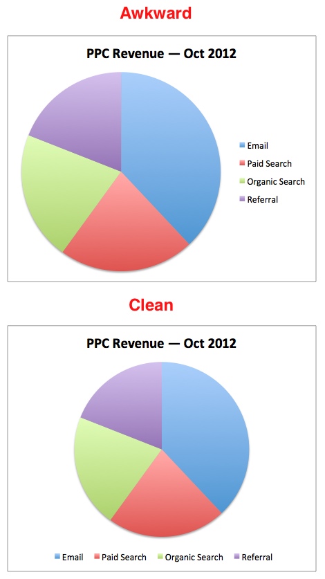
2.  Move The Legend

I don’t know why Excel positions the legend to the right of a chart by default. In most cases, it’s terribly awkward. I prefer to move the legend to the top or bottom of a chart. I tend to put the legend above more than below, but I’ll put it below if there’s too much going on at the top, or sometimes, with a pie chart.

To move it, just pull up the formatting option (you should know how by now!) and choose the position from Legend Options category, which is called Placement on a Mac.

With the legend still selected, I usually bump the font up to 12 as well. You don’t have to select the text, just the box. You be the judge which looks better…
legend placdement in Excel charts

3.  Delete Legends With One Data Series

If you’re only showing one metric on a chart, there’s no reason to keep the legend that Excel throws in there. Just make sure you include the metric you’re showing in the chart title.

Click for larger image.

4.  Add A Descriptive Title

A common mistake I see with marketers’ charts is they’re oftentimes missing a title. When you’re the one pulling together the data, everything you’re trying to communicate is perfectly clear. But for others who have to try to figure out what you’re trying to communicate, it’s not always so apparent.

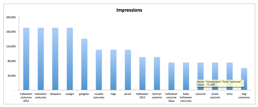
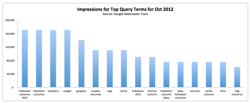
So, in the case of the chart below, it would be insufficient to just use “Impressions” as the chart title:
Excel titles

To add a chart title, with your chart selected, choose Chart Tools > Layout > Labels > Chart Title. On the Mac, you’ll choose Charts > Chart Layout > Labels > Chart Title. I always choose Above Chart (Mac: Chart at Top).

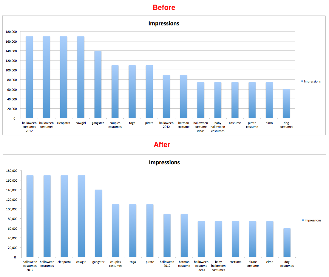
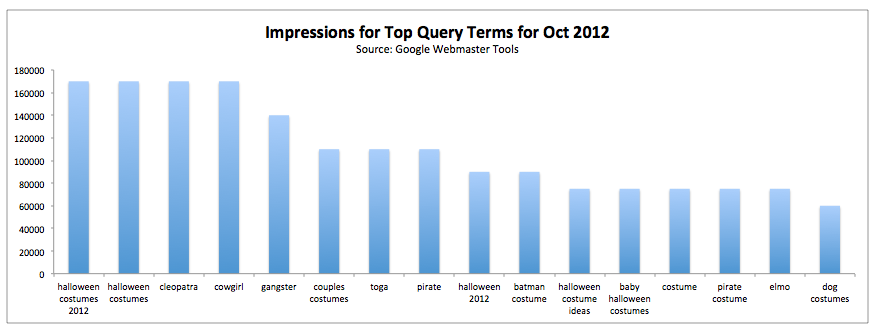
5.  Sort Your Data Before Charting

This one is actually a big deal to me. Charts that are spawned from unsorted data are, in my opinion, much more difficult to read and interpret.

If you’re showing something sequential, like visits per day over a period of a month or revenue per month over a period of a year, then ordering your data chronologically makes the most sense. In the absence of a dominant sort pattern like that, I’m of the opinion that data should be ordered and presented in descending order to put the most significant data first.

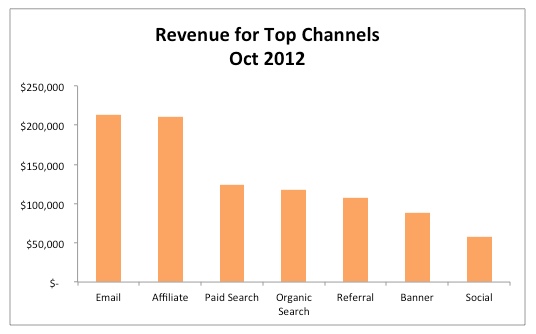
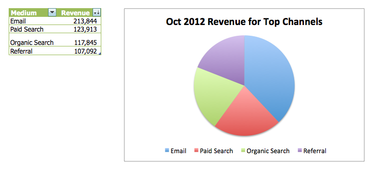
If you look at the data in the chart immediately below, I think you’ll agree that your eyes have to dart back and forth to sort the channels by revenue.

However, in the chart below, which is sorted in descending order, it’s easy to sort and interpret because it’s basically done for you.

This is another benefit to formatting your data as a table before charting it out — the ability to sort is built into the filters baked into every table heading. And if you already created the chart from the table, all is not lost. Once you sort your data in the table, your chart will update automatically.

6.  Don’t Make People Head Tilt

Have you ever seen a chart that does this?

axis labels in Excel

Click for larger image.

Or worse… this?
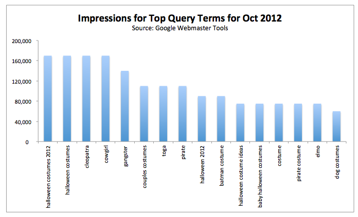
axis titles in Excel

Click for larger image.

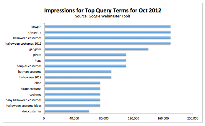
This can make data interpretation laborious and vulnerable to misinterpretation. If you have longer labels, it’s better to expand your chart enough to make room for the axis labels to be displayed horizontally or (even better) use a bar chart instead of a column chart, like so:
axis formatting in Excel

Click for larger image.

Tip: With bar charts, if you want the larger values to be at the top of the chart, like you see in the chart above, you need to arrange the table data for that column (in this case, the Impressions column from my Google Webmaster Tools export) inascending order instead of descending order.

It’s counter-intuitive, in my opinion, but if you don’t, you’re going to have the most insignificant data at the top of your chart. And people naturally read charts from top to bottom, so I want to put the most important data at the top.

7.  Clean Up Your Axes

This chart below is a royal train wreck and has everything I hate most in chart axes.

Click for larger image.

Before doing anything to the axes, I’m going to remove the gridlines and the legend. I’ll focus on five common problematic formatting issues I see in chart axes.

Missing Thousands Separators

If you have data points that are greater than 999, you should include thousands separators. The best way to do this is to format the data in the table. If you do that, the chart will update automatically. Otherwise, you need to unlink it from the source in the Format Axis dialog.

To add thousands separators, select the entire column and click the button with what looks like a comma in the Home tab in the Number category. Excel always adds two decimal places, which you have to get rid of by clicking the Decrease Decimal icon, which is two spots to the right of the thousands separator.

Alternatively, you could get into the formatting dialog and modify the number formatting there.

Cluttered Axes

The vertical axis in the chart above is also cluttered and overkill. To rectify this, select the axis and open the formatting dialog. Under Axis Options (Mac: Scale) you can change the Major Unit setting. In the screenshot below, I changed the major unit from 20000 to 40000.

By all means, if you need more granular detail, adjust your settings appropriately.

Click for larger image.

Unnecessary Decimals

Never include decimals in an axis, unless your maximum value is 1 (in other words, you’re only dealing with fractions). I see this most commonly done with currency, where you’ll see labels like $10,000.oo, $20,000.00, $30,000.00, etc. It’s extraneous and noisy.

Decimals Instead Of Percentages

If you’re trying to show percentages in the vertical axis, format them as a percent; don’t format the data as decimals. The less time people have to spend interpreting your data, the more compelling it will be. But, again, even with percentages, drop the decimals. In other words, don’t have labels like 10.00%, 20.00%, etc. Just use 10%, 20%, etc.

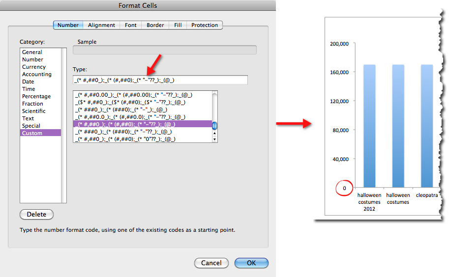
Weird Zero Formatting

One final nuisance is the presentation of the 0 at the bottom of the vertical axis as a hyphen. This is very common. You can read my post on custom number formatting to learn about how custom number formatting works. You might find some very surprising options, like the ability to add text to the formatting while still keeping the value of a number.

In this case, we just need to change the way 0 is formatted. To do this, select the column in the table where the data comes from, open the formatting dialog as usual, and select Number > Category: Custom, find the hyphen, and replace it with a 0.

Click for larger image.

As a finishing touch, I gave the chart a better title, and here’s the final result:

Click for larger image.

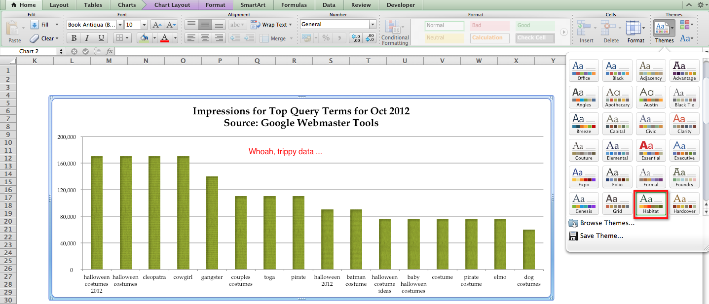
8.  Explore Other Themes

Excel’s chart formatting options are pretty impressive, but most people never leave Excel’s default “Office” theme.

There are 53 themes offered in the 2010 version for PC and 57 themes in the 2011 version for the Mac. And each theme comes with its own unique set of chart formats — 48 in all. That’s 2,544 built-in chart formatting options for 2010 and 2,736 for 2011. (Whooooahhhh. Double rainbowww…)

You can switch themes by going to Page Layout > Themes > Themes (Mac: Home > Themes) and choose from the drop-down menu.

Some of them get a little cra-cra, like the Habitat theme (Mac only) that gives your charts a texture.

Click for larger image.

But you should explore the different themes and try branching out.

9.  Create Branded Charts

You’re not limited to the 2,500+ themes Excel provides. If you want your data to be aligned with your brand, you could create a chart with your branded colors, then save that off as a template.

So, let’s say you doing marketing for Toys R Us (which I’m not affiliated with in any way), and you want to use a pie chart in a presentation with your branded colors. Excel 2010 (PC) will allow you to use RGB or HSL values, whereas Excel 2011 (Mac) will let you use RGB, CMYK, or HSB values.

(Since I wasn’t privy to those values, I used the Color Picker tool in the Web Developer Toolbar to identify the colors from the Toys R Us logo and then used a hex-to-RGB conversion tool to get the RGB values.)

Once you have the values you need, create a chart with whatever data you want to visualize.

Next, select a piece of the pie chart by clicking on the pie chart once and then on the individual piece. Then reformat it by using the paint bucket under Home > Font — or pull up the formatting dialog.

Assuming you have RGB values, click the drop-down menu on the paint bucket, choose More Colors > Custom > Color Model: RGB (Mac: More Colors > Color Sliders > RGB Sliders). And do that for each piece of the pie.

Your chart may look something like this:

PC: 

To save it as a template on a PC, select the chart and navigate to Chart Tools > Design > Type > Save as Template.

To create a new pie chart based on this template on a PC, simply click inside the data you want to chart (or select the data if it’s a partial data set), then choose Insert > Charts > Other Charts > All Chart Types > Templates (Mac: Charts > Insert Chart > Other > Templates) and select the template you want to use.

Mac:

On a Mac, right-click anywhere on the chart and choose Save as Template. This will save your chart as a .crtx file in a chart templates folder.

10.  Make Your Chart Title Dynamic

Did you know you can make your chart title update by linking it to a cell in your workbook? It’s a bit of a hack, but it’s a cool option that will make you look like a genius to your boss/client/mom.

Dynamic titles are best suited for data that update on a regular basis, like daily numbers entered manually or pulled into Excel from a database.

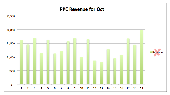
What I’m going to demonstrate is a PPC revenue report that updates daily. The title will show the running total for the month up to that day. Here are the steps you’ll need to take:

Step 1:

 Make sure your data uses proper number formatting and that it’s formatted as a table, which is Excel’s version of a simple database. The reason you want to format as a table is if you build a chart from a table, your chart will update automatically as you add new rows to the table.

The table also automatically expands to absorb any new data you add to the table when you just enter something in a cell immediately below or to the right of a formatted table.

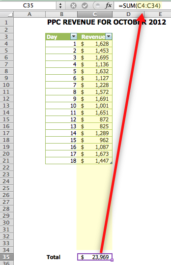
Step 2:

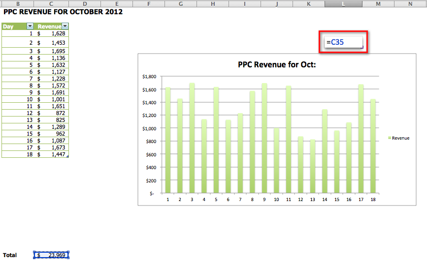
 In a cell just south of row 31 (to accommodate a full month) enter a SUM formula that captures all 31 rows — even though some will be blank if you’re only partway through the month.

Click for larger image.

Step 3:

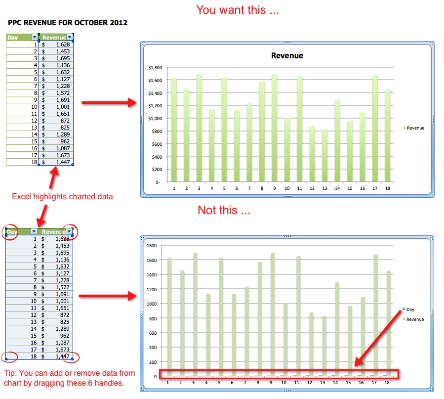
 If we were using both columns of our table as a data series, we could just click any cell inside the table and choose Insert > Charts > Column (Mac: Charts > Column).

But in the table below, we would just select the header and cells that contain revenue data. This is because we don’t want the days of the week to become a data series. You have lots of formatting options under Chart Tools > Design > Chart Styles (Mac: Charts > Chart Styles).

Click for larger image.

Step 4:

 Add a title to your chart that indicates you have a running total. I used: “PPC Revenue for Oct:” for my title. See tip #4 above for directions.

Step 5:

 Since the default fill for the chart area is white and the chart is generally displayed on a white sheet (which I recommend preserving), we’re going to change the Fill to No Fill without anyone being the wiser.

To do this, select the chart and press Ctrl/Command-1, then choose Fill: No Fill (Mac: Fill > Solid > Color > No Fill). You will definitely need to turn off gridlines to pull this off, but you should do that anyway. You can find this toggle under View > Show (Mac: Layout > View).

Step 6:

Select a cell above the chart just to the right of the title and reference the cell with the total. You reference a cell by simply putting an = sign in the cell and then typing in the cell reference or selecting it with your mouse. Excel will highlight the cell you’re referencing with a light blue as a visual aid. Then, format the cell with whatever formatting you used for your title.

Click for larger image.

Step 7:

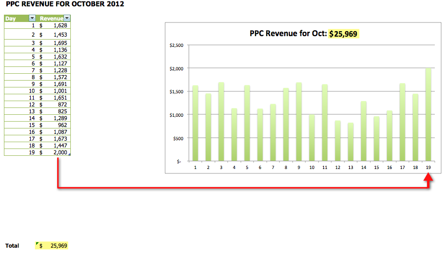
Now, all you have to do is move the chart up and align it with the title. It took some finagling to get everything lined up just right. But then, I just removed the legend since I just have one data series, and voilà! A dynamic title.

Click for larger image.

Step 8:

Now, when you add a new row to the table, the chart and title update dynamically. Slick, right?

Click for larger image.

Clearly, charts provide dimension that’s much harder to get with a table. The good news is you can use any combination of these techniques to make your data sexier and more actionable in just a few minutes, once you get the hang of it.